Notice anything off about referrers recently? Maybe they’re looking at a little sparse, and…not so useful? Do you find yourself longing for days of yore, when you could see the actual page that visitors were arriving from?

You’re not alone! In February, we received a few customer emails about this in a short amount of time, prompting the realization that we had never relayed to you a major change that Google Chrome made in July 2020 which has ultimately resulted in the sad referrer log you see above on the right. So, we sent out the tweet below and created a new knowledge base article about it.
A few people have noted that most referrers we report only show the domain now. This is the new default for Chrome starting in late 2020. And Chrome being the biggest browser in the world means that most referrers we log are affected. https://t.co/adEoQyDzzO
— Clicky Web Analytics (@clicky) February 19, 2023
A few weeks later, Firefox released version 87, which followed Chrome’s lead with domain-only referrers being the new default, which we followed up about here. Up until that point, Firefox was the last browser still living in the golden age of useful referrers, which, sadly, has now officially come to an end after almost exactly 25 years. That’s right, next month is the 25 year anniversary of the RFC for HTTP/1.0, which introduced the infamously misspelled “Referer” header. (It took off too fast to fix and is still the actual header name today 🥴)
This led us down a rabbit hole of deep thought, which eventually resulted in a brand new feature for Clicky, as well as a major overhaul of our visitors report. Let’s dig in!
NEW FEATURE: BACKLINK SEARCH!
This new feature sets up a Google search query for you to find pages on other specific sites that link to your site, aka, backlinks, just by clicking the new icon almost anywhere you see a referrer now (more details below). The search query is like this: “yoursite.com site:othersite.com”.
This isn’t perfect or ideal by any means. If the referring page on othersite.com is brand new, it’s probably not indexed yet. And if your domain is shared amongst many other users, then the default results won’t be ideal. And sometimes Google search results are just silly. But it’s a good starting point that you can further refine as needed.
There are a few services that specialize in finding backlinks that work better than this, but none of them are free, so… Hello, Google!
(If anyone is aware of a free backlink search engine that works well, or a better structure for our search query (“yoursite.com site:othersite.com”), let us know! Google’s “link:” advanced search parameter no longer works, in case you’re thinking of that.)
Here is a new knowledge base article about this feature, that also shows where you can find it throughout your reports.
VISITOR LOG OVERHAUL!
While trying to squeeze the new backlink search into the visitor log, I just couldn’t help overhauling the visitor log in general. But alongside the existing icons to view the referrer and showing the referrer type, that made 3 icons in a row and it was just too noisy. And the referrer type icon really adds a lot of character to this page, in particular by making paid traffic and search traffic stand out from everything else. So, that’s why this new feature is not on this page. But almost anywhere else you see a referrer on Clicky, you’ll see the new icon to find backlinks.
So anyways, the main thing this overhaul does is to show you the landing page URL and title for every visitor, right next to the referring domain. This allows you to make an educated guess about the referrer. If it was a search, you can probably guess what the search term was. And if it’s just a normal link, e.g. from a blog or news site, you can probably guess the context of what the post was about.
This was all technically possible before, and with any analytics service really. But it’s all about presentation, and we feel like our new design is ideal for this exact purpose. Combined with the new backlink search feature, we think Clicky is currently by far the best service for getting any use out of referrers as they stand today.
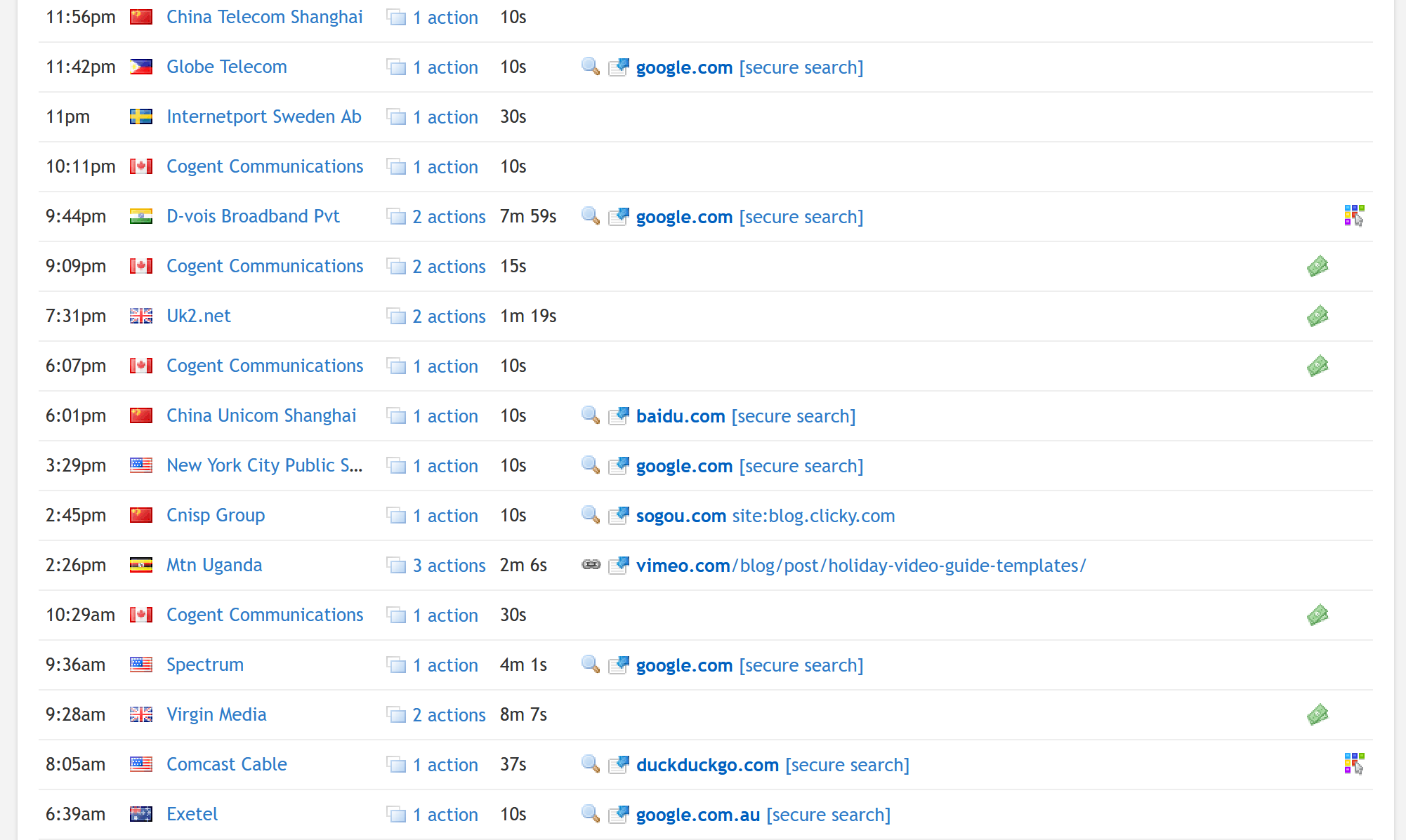
The screenshot below shows this new design, although it’s just from our demo data which is our blog… not the most exciting thing in the world, but you can see for the visitors who have search referrers, we can make some good guesses as to what they searched for land on those pages. (There are other changes too, highlighted below in the bullet points at the bottom).
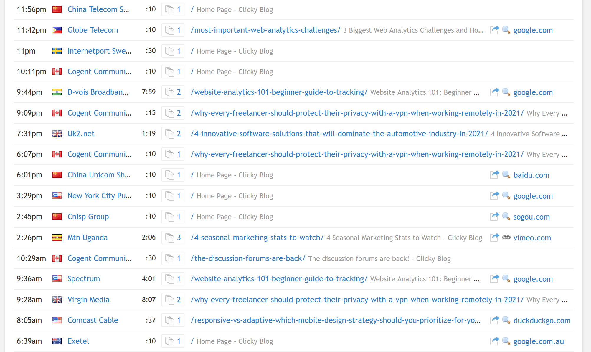
And here is the old design for comparison, with the exact same data slice. Hopefully you can see what a difference the new design makes – just look at all the wasted white space!
There were some other things I’ve wanted to change about the visitors report for a while, so took this opportunity to do just that:
- If there’s no referrer, we let the landing page bleed into the referrer column for that row, to allow maximum room to show you the landing page data. If you have long titles or URLs, this will be particularly useful. Depending on how consistently long this data is and how many of your visitors have referrers, it can be a bit much to look at though. We’ll listen to your feedback and make tweaks as needed. (We made the same change to the action log report, and Spy, as well).
- The “quick view” link is now just an icon and a number, but with an outline around it all to make it look like a button. (The link that previously said e.g. “3 actions”). The purpose of making it look like a button is make it more obviously clickable, but also to reinforce the fact that it acts a little differently than a normal link (since it’s an “in-page” popup). Note that clicking the visitor name/org/IP on the far left will get the same visitor detail report, but on a new page rather than a popup. (Some people don’t actually know this).
- Time formatting has changed, to mostly the hh:mm:ss style. On the visitors report we just show minutes and seconds now, e.g. 15: 25, or just : 25 when we’re dealing with less than 60 seconds. For values over an hour, on the visitor report only, we just keep showing it as minutes, e.g. 75: 25 (again, to save horizontal space). But on every other report where there is more room, it will show the hours, e.g. 1: 15: 25. For high traffic sites who may have some time values over 99 hours, we will round to whole days at this point, e.g. “5d”. The reasoning is that once you cross the 100 hour threshold, not only is it ugly (e.g. 175: 15: 25), but the mental math for calculating days from hours takes slightly more thought once you cross 100 hours. “48 hours”, “72 horus”, “96 hours” — these are all common alternatives to saying 2, 3, or 4 days. You just intrinsically know what each one represents. But no one says “120 hours” (and beyond)… right? Right.
- The “embed actions on the visitors report” user preference has been removed. This would show up to the first 3 actions (page views) for each visitor in the visitor log, below each visitor – but only about 2 visitors would be visible on the page at a time. I was never happy with the way it looked, so now that we show the landing page by default, we’ve removed this option.
- A few “icon” columns bit the dust:
- Heatmaps – this was informational only and was not clickable. It meant that the visitor session had heatmap data available. If you want to find visitor sessions with heatmap data, there is a filter to do just that already, so this had to go (I personally found it useful as I use heatmaps quite a lot, but I can live with having to apply a filter instead to find these visitors).
- Campaigns – Most campaign visitors have a referrer, and we’ve always flagged the referrer type (“traffic source”) as “advertising” when there is a campaign associated with it – so it was mostly redundant. We still show the referrer type icon next to referrer, so you’ll see the dollar icon there still for “advertising”.
No matter what browser makers do in the future, just know that we’ll always try to find ways to innovate like this.