
What started out as a small request to add an option to compare the same day of week instead of day of month from one year ago, ballooned into a much bigger project that took about 10 days of work. A lot of our code for graphs and trends is pretty old, so a large portion of this update was just cleaning that up significantly so future updates like this should be a lot easier.
Most websites have consistent patterns of traffic on each unique day of the week, or at least significant weekday vs weekend differences, so it makes sense that the day of week should always match when comparing the past.
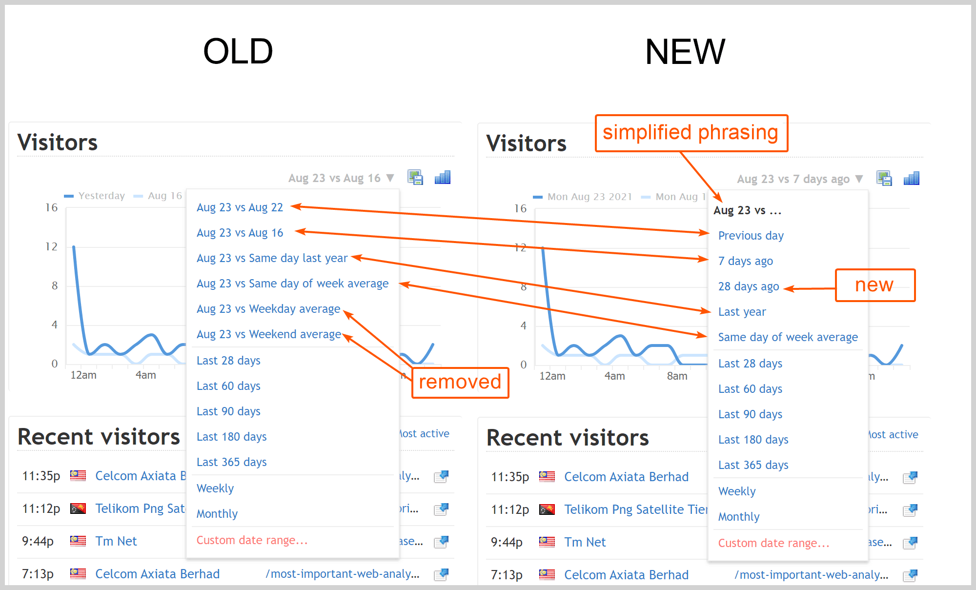
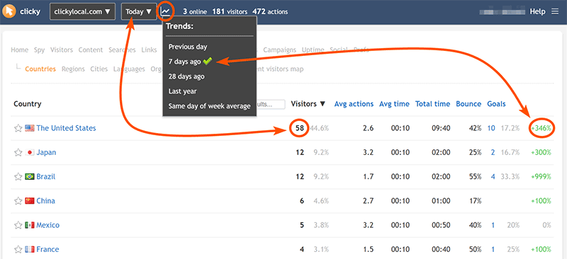
That’s a big part of what this update is about. The default trend before was “yesterday”, it is now “7 days ago”. You can of course change this back to “yesterday” using the trend menu or in your user preferences. We’ve also added a new “28 days ago” option and rephrased a few of the others:
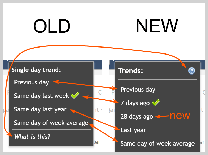
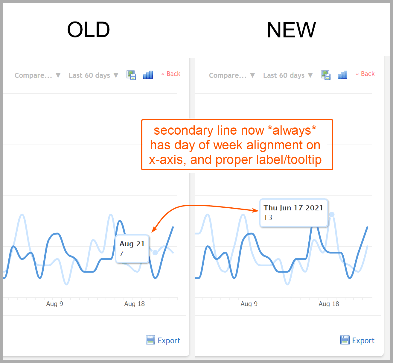
Likewise with graphs, part of the reason we’ve always had “last 28 days” as one of the default options was so that when comparing the immediately preceding period, the days of week would line up. We’ve kept the “28 days” as standard for the smallest option for now, but no matter what date range you choose now, the days of week will ALWAYS line up, so you’re always comparing apples to apples. Days of week also always match for trend percentages too.
The tooltip for secondary comparison lines is also now properly labeled. The correct value was always shown before, but the label displayed was for the primary line, which didn’t matter for comparing two unique data types, but was horribly confusing when comparing the same data type over two date ranges.
We’ve also cleaned up and simplified the hourly comparison section at the top of the menu, and added a “28 days ago” option here as well, for data types that support hourly data:
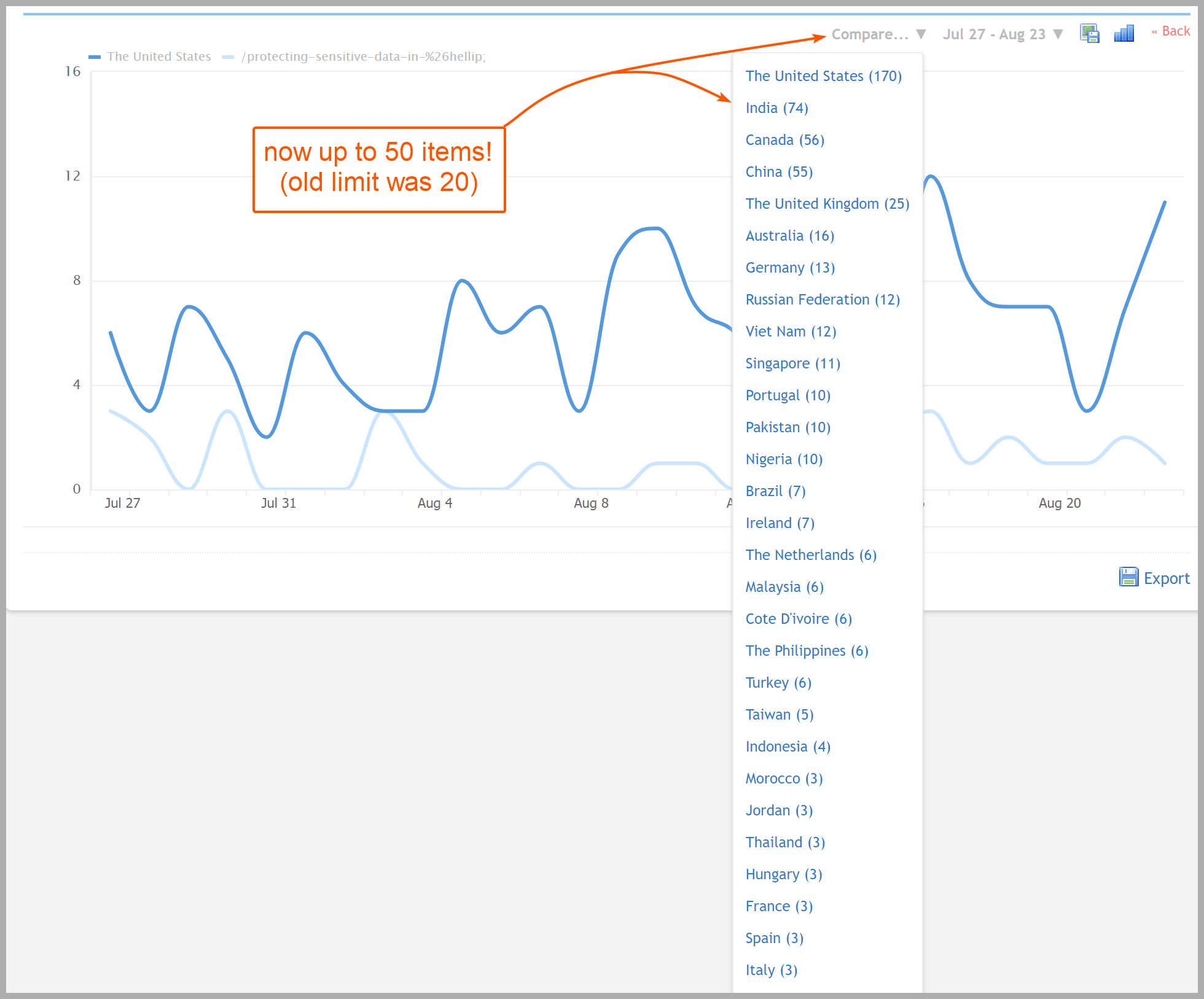
Lastly, in the “Compare…” menu, you could choose a specific data type and item of that type to compare against. E.g. if you were viewing your visitor graph, you could click “Compare…”, then “Countries”, then “United States”, to see how many visitors were from the US vs total visitors. However, you could only choose from the top 20 items in that cateogry. This was fine if the item you were interested in was one of the top items, but if it was more of a long tail item you wanted to view, you were out of luck. We’ve increased this limit to 50 now. Ideally we would add some kind of pagination or “more…” link so it was limitless, but for now this is very helpful for the way we use Clicky ourselves.
The trends knowledgebase article was given a hefty update which we highly recommend reading. It contains a lot of good information for how date ranges are calculated when matching day of week, and things like that. It also has a nice new screenshot showing what exactly the trend option you select does in the reporting interface, which I’ll copy here as well:
One final change is that daily graphs now always show the “previous period” comparison by default. Before, you had to load this via the “Compare…” menu, and I honestly don’t think enough people know that that menu is even there. Also the inconsistency between the default of hourly graphs always showing comparison data, but daily never showing it, was really bugging me. It’s been like that since we added hourly data around 10 years ago. It may throw you off a bit because you’re only used to seeing in the visitor graph, but give it a chance to grow on you.