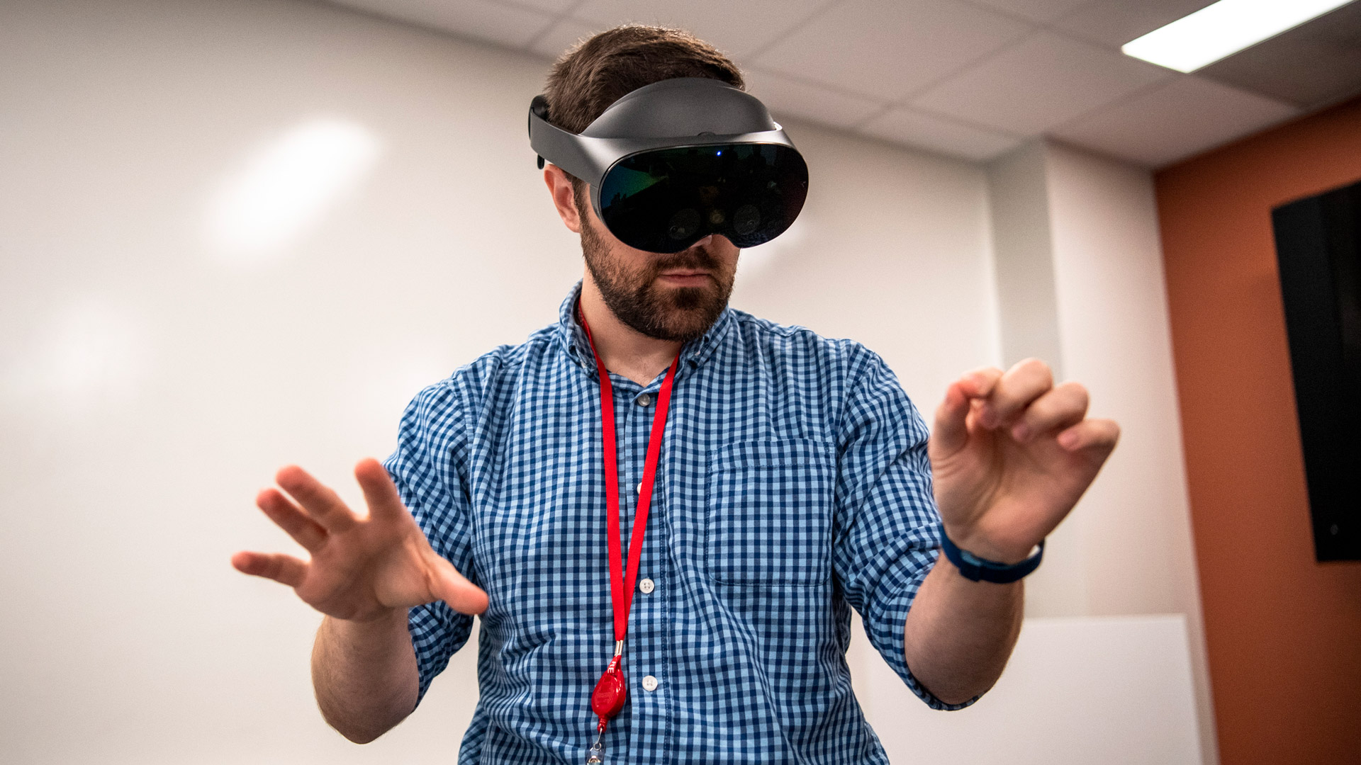
Quest Pro is here and brings with it some welcomed hardware improvements but a dubious value proposition that’s highly dependent on someone else making the right apps.
There’s two ways to look at Quest Pro:
- A better and more expensive Quest 2
- A headset with new features that wants to transform the way you work
The former is pretty straightforward. If you plan on gaming just like you do on Quest 2, Quest Pro is in most ways the superior device. But when you factor in the $1,500 pricetag, there’s just no way the improvements are worth the cost of admission. And that’s fine, Meta really isn’t selling Quest Pro as a Quest 2 upgrade.
Instead the company is marketing some vague value proposition that Quest Pro will ‘transform the way you work’. Officially the company claims that Quest Pro is made for “builders, designers, and inventors. Architects, product designers, prototypers, game developers, engineers, and researchers have historically designed 3D products and experiences on 2D screens. We are giving these builders the ability to visualize their creations in 3D while getting a sense of scale and proportion in context to the environment.”
In theory that makes a lot of sense. In practice, the whole premise is undermined by a host of usability issues and a lack of high quality first-party software that delivers clear value. Meta seems to be banking entirely on someone else building the headset’s core enterprise functionality, at launch making Quest Pro feel like an experiment more than a product.
Finding the Value Proposition
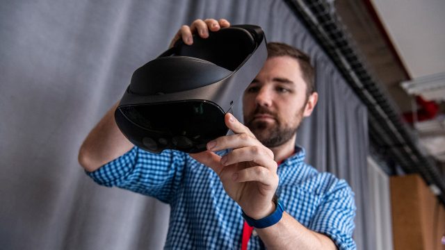
So there seems to be two core ways that Meta expects customers to get value from this $1,500 headset. The first is by using it as a portable workspace, either by tapping into the inbuilt browser or using some sort of virtual desktop software. The second is that maybe you get lucky and somebody builds a third-party ‘killer app’ for your specific workflow.
Curiously, neither of these use-cases really demand the hardware that Quest Pro brings to the table. While some apps are enhanced by what Quest Pro does uniquely (better passthrough and expression tracking), I’ve yet to see an app that really uses them in a way that’s indispensable, making much of the headset feel like new hardware in search of a problem to solve rather than an answer to a critical need.
Usability Debt Rises to the Surface
The thing is, if you look at Quest 2 as a VR game console, it’s a pretty attractive product because it does one thing quite well: play VR games. And when you’re using it to play games, many of the headset’s serious usability issues are masked because generally you’re launching into a single app and then spending almost your entire session inside of it.
Productivity, on the other hand, generally means jumping between lots of different applications and workflows… something that Quest 2 (and, with its identical interface, Quest Pro) is really bad at.
The issues there start at a fundamental level with the Quest interface. Though it began as mere menu, over time Meta has attempted to morph it into a sort of operating system interface. The result? A truly clunky nightmare of usability issues.
And a feeling of productivity isn’t lost just because the system interface is problematic and because jumping between apps is slow, but also because the entire architecture of the platform treats every app as its own siloed experience. So jumping from one app to another to try to get stuff done means dealing with a mess of different interfaces, different avatars, different friends/invite systems, different capabilities etc.
First-party Problems

Meta has sorta-kinda attempted to fix this with Horizon Workrooms, a single app that functions as both your personal office (via remote work on your PC or Mac) and a place where you meet immersively with colleagues. In theory that sounds great, but there’s a few key problems.
For one, Workrooms doesn’t even come pre-installed. You could easily end up with a Quest Pro and literally never know that what is ostensibly supposed to be core functionality (remote PC and immersive meetings) is actually hiding in some app you have to find and download from the store.
And what’s more… Workrooms just doesn’t come close to reaching the ease-of-use it needs to make people actually prefer to use it over other options that do not involve being in a headset. Much like the Quest system interface, Workrooms is wildly clunky and really quite unintuitive.
I’ve been professionally working in the VR space for more than a decade now, and while I’m able to figure it out, I can only imagine an employee (with minimal or no VR experience) getting a Quest Pro headset and trying to figure out how to use Workrooms.
I can already hear the poor support person trying to help out on the other end of a call:
Did you click the button on the bottom bar? No, the other bottom bar. You have to close the first bottom bar with the right button on your controller. You aren’t using the controllers? Ok pinch your fingers together then move your fingers down over the Oculus logo—I mean Quest logo—while you’re still pinching then let go of your pinch. Did the first bar close? Ok now on the other bar you see in front of you, click the button with the computer icon. You can’t see your pointer? Try moving your hands closer to the little screen there. No not too close, you can’t just tap the button with your finger, you have to pinch to select. Ok now click that computer icon. Do you see anything in the list? No? Ok make sure you launched the remote software on your computer. Yes, take off your headset and go to the website and download that and install it. Then put your headset back on and click that computer icon again.
Everything Quest Pro wants to accomplish makes sense; the execution is just seriously lacking for any ‘professional’ who expects to use the device for general productivity work. The intended use cases just aren’t sufficiently supported by high-quality first-party apps and capabilities.
Third-party to the Rescue (Hopefully)
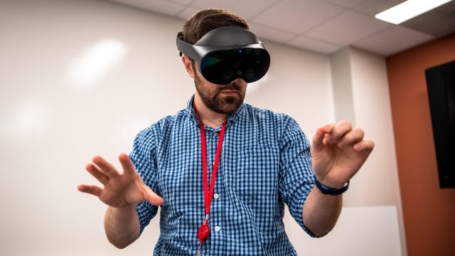
A lack of high-quality first-party productivity features leaves the headset entirely dependent on third parties to pick up the slack… something Meta seems to be seriously praying for.
To that end, the one place that Quest Pro could prove truly useful is if there’s a single third-party app out there that directly benefits your workflow. And maybe there is… maybe you do 3D design and would really benefit from using an app like Gravity Sketch to brainstorm and sketch out models and ideas. Maybe you’re an architect and would really benefit from using an app like Resolve to visualize large 3D models for construction projects.
But this is the kicker… Quest 2 can run those apps effectively just as well as Quest Pro. So, what is Quest Pro bringing to the table?
How about the headset’s new capabilities? Better quality passthrough AR and expression tracking are nice to have… but today Meta doesn’t have an out-of-the-box killer app for them, either first or third-party. So why not just get a Quest 2?
 In its present state, using Quest Pro for the things Meta is marketing feels a bit like trying to use your Xbox as a productivity PC. Like… yes, you actually can browse the web on an Xbox, but an Xbox is way better at playing games than browsing the web. And right now Quest Pro is better at playing games than anything else.
Mixed Reality Marketing

Perhaps Quest Pro’s most marketed feature—mixed reality—is still very undercooked. You can manually outline your room to make the headset aware of what’s around you, allowing some apps to interact with those (exclusively rectangular) surfaces that you’ve told it about. But it’s a tedious process which currently provides minimal benefits. And like much else of the system-level Quest functionality, it’s got tons of usability issues; things as obvious as the instruction window blocking your view as you try to draw outlines.
But let’s say you don’t care about the headset being aware of the shape of the room around you. Passthrough still could have another huge benefit which would be allowing you to easily interact with the outside world without taking off your headset. Things like checking your phone or reading from a sheet of paper is the kind of practical usage you’d want for that, but Quest Pro falls short with not enough resolution and still fairly ‘bumpy’ depth estimation for near-field objects.
Even just for wanting a feeling of not being fully immersed by leaving the passthrough background turned on while you work is not quite fully there yet. After using Quest Pro as a browser-based workstation with keyboard and mouse for at least an hour I found I got slightly dizzy and opted to turn off passthrough.
It’s Not All Bad, Just Expensive
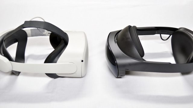
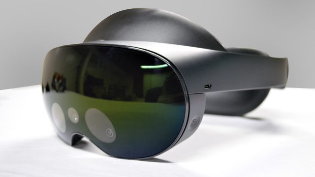 Well, there are a few reasons you might actually want Quest Pro today. The form-factor is a little nicer, though I wouldn’t go as far as calling it obviously more comfortable (unless you’re measuring by the terrible soft strap that comes included with Quest 2 out of the box). The benefit in clarity, thanks to the new lenses, is definitely a noticeable improvement, but you’re ultimately seeing the same number of pixels… but sharper. The Touch Pro controllers are probably the clearest single win from the headset… but they’re also compatible with Quest 2.
Does any of that justify paying $1,100 more than a Quest 2? Doesn’t look like it to me.
Continue on Page 2: Getting Technical »
,
Getting Technical
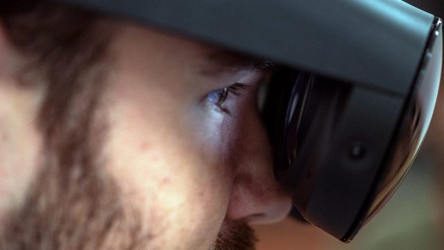
Much of this review is focused on the value proposition of Quest Pro as it purports to be something substantially different from that of Quest 2. But you know we love to get technical around here so I’m going to break down some of the more objective details of the headset.
Visuals
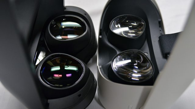
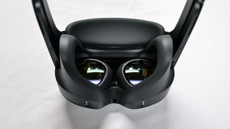
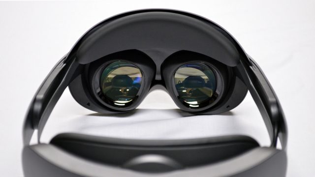 Despite having the same resolution as Quest 2, Quest Pro’s lenses are clearly superior. They make the headset a little more compact and the image a little sharper, but more importantly they clean up many of the artifacts that have plagued the industry-standard Fresnel lenses that we’ve seen in most headsets for years.
The painfully obvious god-rays seen emanating from bright objects on dark backgrounds are almost entirely gone and the ‘sweet spot’ (the clarity of the lens from the center out toward the edges) is among the best I’ve seen on any headset to date. So although there aren’t more pixels on the screen, the clarity gets a noticeable boost over Quest 2 thanks to the clearing up of these visual artifacts.
The tradeoffs for these benefits are very minimal in comparison to what you’re getting. There’s some brightness falloff on the extreme left and right, and a bit of distortion at the very edge of the lens (but far enough away as to not be bothersome). And the field-of-view is nearly identical to Quest 2.
Everything else is pretty much top-of-class as far as I’ve seen: pupil swim, chromatic aberration, persistence blurring, etc. (some of these apply to the display rather than the lenses, but you get my point). Interestingly there’s some obvious ghosting from the display but it disappears entirely once the display warms up (seemingly in 10 minutes or so).
So although there aren’t more pixels on the screen, the clarity gets a noticeable boost thanks to the clearing up of these issues. Part of this is also helped by the fact that Quest Pro has a wider and continuous IPD range than Quest 2, along with an eye-relief adjustment. The headset will sometimes prompt you to re-adjust your headset with a guided calibration to make sure the lenses are in the best spot for your eyes. Ultimately this means more people will find their way to the ideal lens position, meaning a better looking image for more people.
The display also has a wider range of contrast than Quest 2—with noticeably deeper blacks—along with more saturated colors.
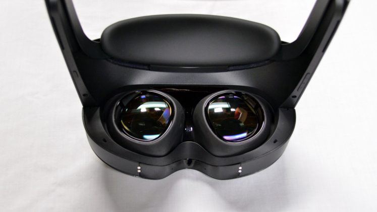
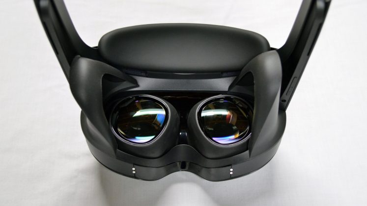
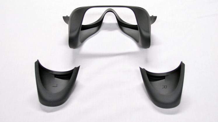
And while the god-rays are practically eliminated, the open-side design of the headset means you may get glare in the lenses from outside light. You can attach the included light-blockers which mostly takes care of this issue (except for light from below) of you purchase the optional ‘full light blocker’ accessory can block all outside light.
Controllers
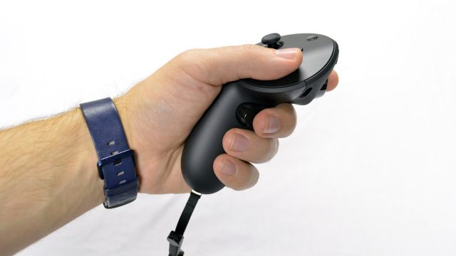
Quest Pro’s controllers (called Touch Pro) are one of the best things about the headset. For me they’ve got the best fitting handle since the original Oculus Touch.
I’ve been surprised to find that from a tracking performance standpoint, the controllers feel almost identical to me compared to the Quest 2 controllers, even in fast and demanding games like Beat Saber. And of course the move to inside-out tracking on Touch Pro means they can track anywhere around you without losing their position, all while making the controllers more compact by removing the tracking ring.
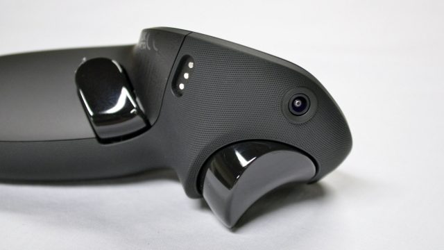
This has obvious benefits for people with longer arms, games where you might need to hold something in one hand while looking in a different direction or reach behind your back, and games where you might put one hand in front of the other for long periods (like when wielding a two-handed weapon). Even just setting your hands down in your lap is a more stable experience than with the Quest 2 controllers.
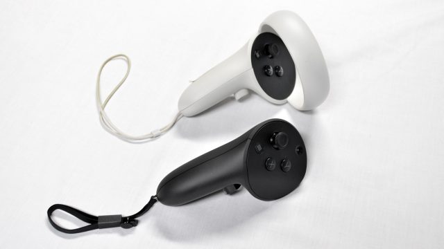
The new haptics feel more powerful and satisfying, though it’ll be some time yet before developers really put them to good use by designing specifically around the controller’s haptic capabilities.
The other new features of Touch Pro (precision pinch and the stylus on the bottom) are essentially non-existent in any application at this point (except Workrooms), so we’ll have to wait and see if they truly prove useful into the future.
The Touch Pro controllers are all-around pretty much just great, with the only minor downside being that it sometimes takes 5-10 seconds for them to synchronize their position with the headset (you will see them tracking but clearly offset from your hands until they sync up).
And did we mention they have rechargeable batteries and they’re compatible with Quest 2?
Audio
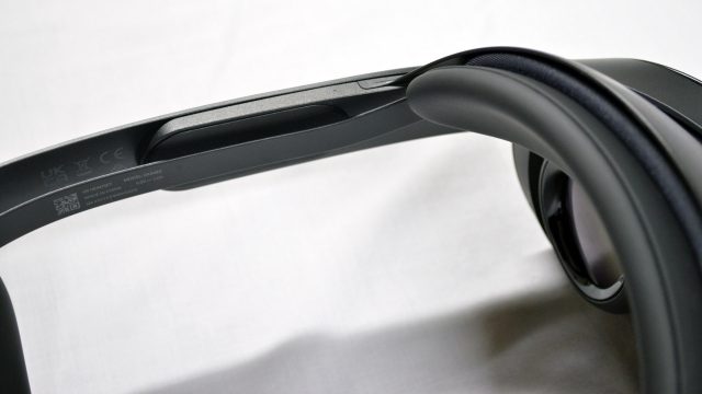
Quest Pro’s speakers do sound a bit better than what’s on Quest 2 with a bit more power in the low-end, though I found I needed them cranked to maximum volume in most games in order to have sufficient volume. They’re still not the highly immersive sound you’d crave for doing serious gaming, but they feel for the most part acceptable (whereas Quest 2’s speakers feel to me like too much of a compromise).
Ergonomics
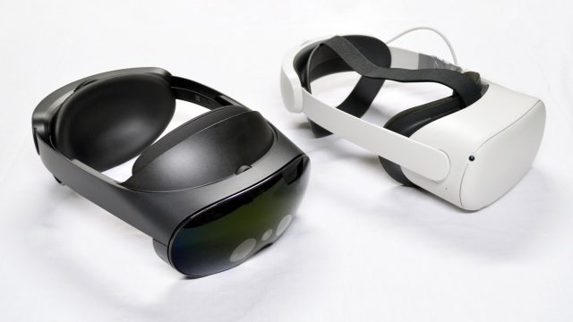
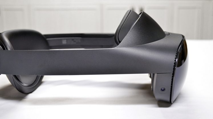
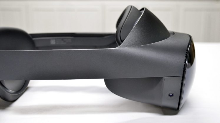
Quest Pro’s form-factor was redesigned to make it more compact and improve comfort. If your bar is the Quest 2’s default soft strap, I’d say Quest Pro is more comfortable. But compared to Meta’s own aftermarket elite strap (or many others), I find Quest 2 to be a bit more comfortable.
This seems entirely the result of Meta removing the top-strap, which takes most of the headset’s weight and squeezes it against your forehead instead of letting most of the weight ‘hang’ over your head with less squeezing of the front and back of your face. Quest Pro absolutely should have included at least an optional top strap, like both Magic Leap 2 and HoloLens 2 had the foresight to do.
The key issue with Quest Pro’s headstrap design is that the front forehead pad only sits best on your forehead at one specific spot (where the curve of your forehead most closely matches the curve of the pad). But the curvature of people’s foreheads can vary quite significantly. So that perfect spot for the pad to rest on your forehead might not be the perfect spot if you want your eyes to align with the lenses in the ideal place.
So for the portion of people who have that optimal curve on their forehead in just the right spot, Quest Pro will probably be plenty comfortable. For the rest of us, it becomes a choice between fitting the headset in the ideal spot for comfort or the ideal spot for lens alignment. In practice I find myself grabbing the headset for a slight adjustment on my forehead every 15 minutes or so in order to relieve some pressure as I alternate the positions between ‘most comfortable’ and ‘best lens alignment’. A lens height adjustment also could have fixed this issue.
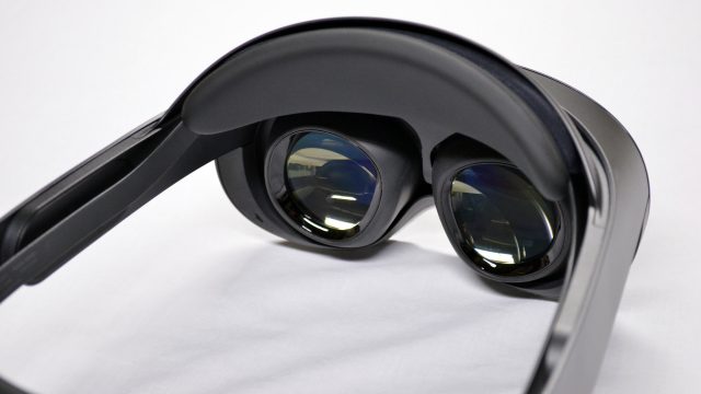
The one thing I actually like about the Quest Pro strap is that they brought back the springy struts from the original Oculus Rift (and a handful of other headsets since). With those you put on the headset and adjust the tightness how you like it, then when you remove the headset you can pull the display forward to stretch the headband making it easier to remove. Then you do the reverse when you put the headset back on. The result is that the strap stays at the tightness you want but you don’t have to loosen it and tighten it every time you take it off and put it on—like a baseball cap with a stretchy headband.
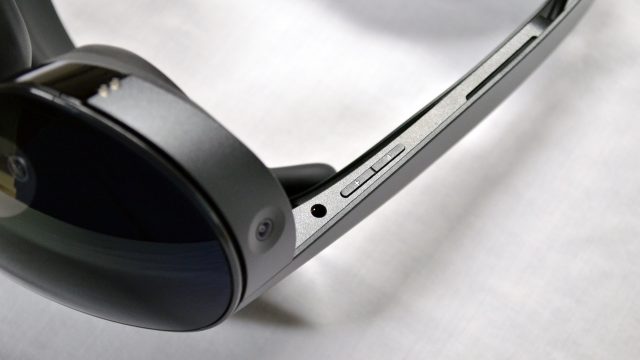
And a few other ergonomic notes: the power and volume buttons are in a pretty terrible place (on the underside of the headstrap near your left and right temple. On multiple occasions I’ve been putting the headset on or adjusting the display enclosure and accidentally put my headset to sleep or cranked the volume all the way down—because the buttons are right where you’d want to grab the headset when doing so. While the IPD of the lenses and the rear tightening dial is easy to adjust with the headset on, the eye-relief dial is stubbornly difficult to turn (to the point that I thought it was broken). Removing the headset actually makes it much easier to turn the eye-relief dial (seemingly a mechanic oversight with the way the dial works against the pressure from the headset being on your head).
As for the light blockers: both snap on easily but feel tight around the face (I think this will be annoying for anyone that feels they have a ‘wide face’). The way the light blockers are shaped means they can sometimes fold in uncomfortable ways and it can be awkward to finger them back into the right spot. At least they pop on and off easily with magnets, though the included pair have an unintuitive shape that feels like a mini spatial puzzle the first few times you try to attach them to the headset.
As ever, I’m sure there are plenty of unanswered questions and I’ll do my best to respond to them in the comments below.
