Instead of taking you right to your library of installed apps, Meta is making yet another perplexing change to the Quest landing page in v57.
Since the earliest days of Meta’s VR platform, the company has been seemingly obsessed with not putting your library of VR apps front-and-center.
Instead the first thing you see when you put on a headset from the company, or launch its companion smartphone app, is some kind of dynamic ‘feed’ with content you weren’t looking for in the first place.
The Ever Changing ‘Explore’ Page
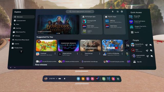
For a long time when putting Quest on your head Meta made you look at ‘Explore’, an algorithmically-curated assortment of disparate content that was not your library of installed apps.

Seemingly forever unhappy that people don’t love the Explore page, Meta has constantly reimagined it over the years, changing the layout what seems like every six months. I swear every time I’m finally used to it, it changes.
And once again, it will change.
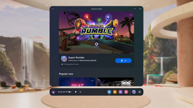
In the newest Quest v57 update Meta is replacing the Explore landing page with a new and freshly confusing ‘Horizon Feed’, which is also not your library of installed apps.
Sensibly, you might think the Horizon Feed would contain only content from Horizon Worlds, acting as a sort of portal for you to jump into the company’s miniverse. But no, apparently in Horizon Feed you’ll find all manner of games, apps, and of course, Reels!

Yes, Reels… the company’s short-form 2D video content that’s designed for quick and casual viewing on a smartphone. Certainly when I put on my headset that’s what I want to see—not my library of installed apps.
Below the Fold
Even the headset’s companion smartphone app, the ‘Meta Quest’ app, doesn’t want to make it easy to access your library of installed apps. Instead, the first thing you see when you launch the app is a smattering of algorithmically-curated content—a feed of course—that you weren’t looking for when you put your headset on in the first place.
Did you know that you can actually remotely launch VR apps on Quest right from the smartphone app? It’s incredibly convenient.
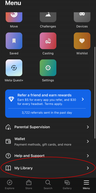
Or it could be, but most people don’t even know that’s possible because to even find your library of installed apps you need to launch the smartphone app, click ‘Menu’ (the last option on the toolbar), then scroll down below the fold to finally find ‘My Library’. Counting from the top of the page, it’s the 17th item down the list of Menu items. It has moved progressively further and further down the page down the years.

Literally ‘Parental Supervision’ and ‘Help and Support’ are placed higher on the list than your library of installed apps.
Does Meta really think that Parental Supervision (something which doesn’t even apply to many users), and Help and Support (how often do you think people need help for this product), should be easier to reach than the user’s library of installed apps?
Feed Me
I guess we shouldn’t be surprised that Meta has an obsession with algorithmically-curated feeds. It’s the thing that defines the company’s core products (ie: Facebook, Instagram), and small changes to their feed algorithm can have major influence over how long people stay on those platforms and how much they engage.
But here’s the core problem with Meta’s feed obsession. While casual and even mindless scrolling is the norm on smartphones—devices which can be engaged and disengaged with in a matter of seconds—this couldn’t be further from the truth for VR headsets.
Anyone putting on a VR headset already has a damn good reason to bother putting it on in the first place.
They already know what they want to do; getting between them and that thing is just compromising the user experience. If you want to hit them with a feed, do it after they’re done with the thing they intended to do in the first place. And while you’re at it… maybe instead of hiding their library of installed apps—you know, the content they hand-picked and paid for—why not make it easier for the user to launch them in the first place so it’s easier for them to return?
Now of course people at Meta are reading this and saying ‘we’ve got all these stats that show that people really click on the stuff in the feed!’ I’m sure you do… and it’s because that’s the thing you’re constantly putting in front of their face.
Metrics will lead you astray if you aren’t measuring the right things. You’d better believe that friction—the process of putting on the headset and getting to the thing you actually want to do—is and has long been one of VR’s biggest issues. If that’s not what you’re optimizing for (these feeds certainly aren’t) then you’re just crippling the overall user experience.
It’s the people that don’t come back to the headset that you should be most carefully observing, not looking to see if you can steer someone to a different piece of content after they’ve already decided to put the headset on.

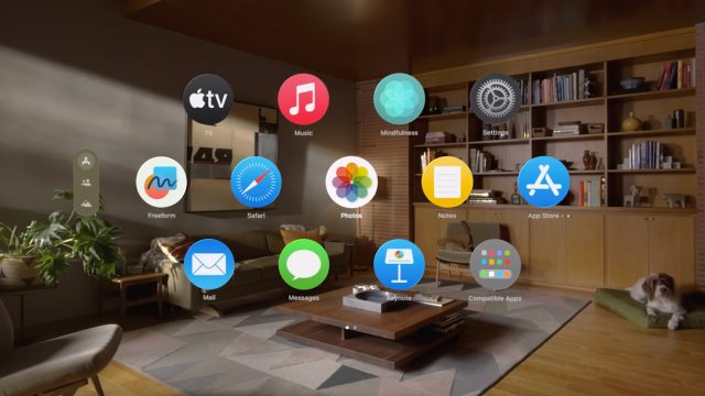
Standing in stark contrast to Meta’s approach is Apple Vision Pro. When you put on the headset, what’s the very first thing you see? Your library of installed apps.
,
