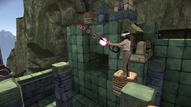
Eye of the Temple is one of the rare VR games that focuses on not just on pure room-scale movement, but dynamic room-scale movement. The result is a uniquely immersive experience that required some clever design behind the scenes to make it all work. This guest article by developer Rune Skovbo Johansen explains the approach.
Guest Article by Rune Skovbo Johansen
Rune Skovbo Johansen is a Danish independent game developer based in Turku, Finland. His work spans games and other interactive experiences, focused on tech, wonder, and exploration. After positive reception of the 2016 VR game jam game Chrysalis Pyramid, he started working on a more ambitious spiritual successor, Eye of the Temple, and at the end of 2020 he quit his day job to pursue indie game development full-time.
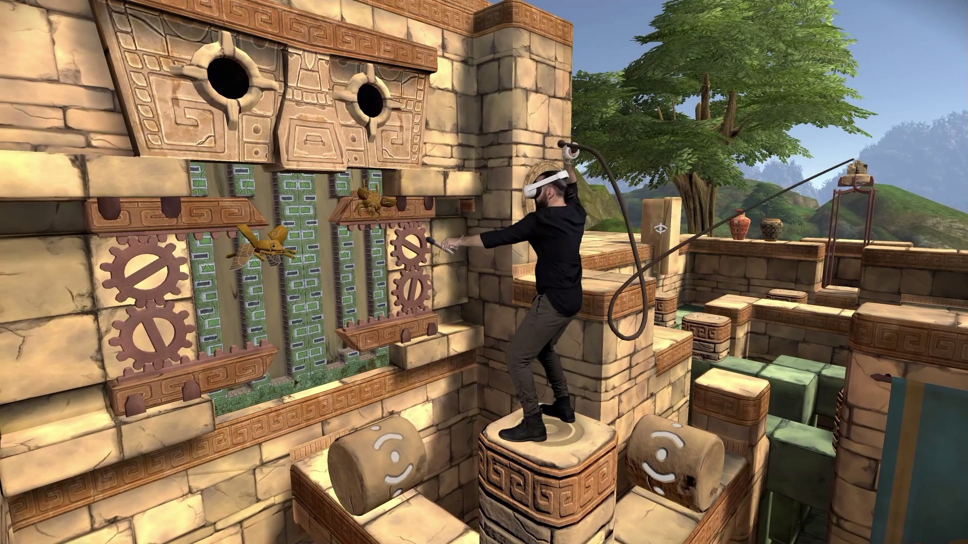
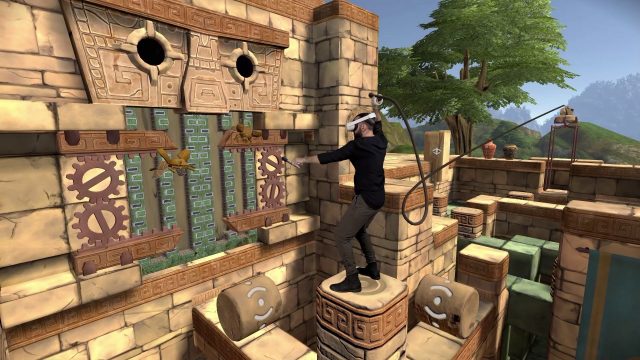
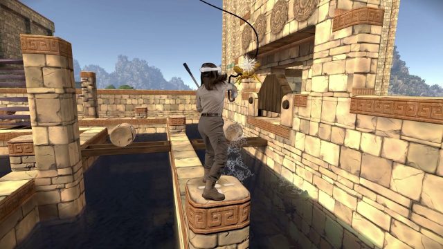
In Eye of the Temple, you move through a vast environment, not by teleportation or artificial locomotion, but by using your own feet. It makes unique use of room-scale VR to deliver an experience of navigating an expansive space.
In Eye of the Temple you move around large environments using your own feet
But how does it work behind the scenes? To mark the upcoming release of Eye of the Temple on Quest 2, I wanted to take the time to explain these aspects of the game’s design that I’ve never fully gone into detail with before. In this article we’ll go over a variety of the tricks the game uses to make it all work. Let’s start with the basics of keeping the player in the play area
Keeping the Player in the Play Area
Say you need to go from one tall pillar in the game to another via a moving platform. You step forward onto the platform, the platform moves, and then you step forward onto the next pillar. But now you’re outside your physical play area.
Moving platforms are positioned in a way to keep players inside the play area
If we instead position the moving platform to the side, it goes like this: You sidestep onto the platform, it moves, and you sidestep onto the next pillar. Since you took a step right, and then left, you’re back where you started in the center of the play area. So the game’s tricks are all about how the platforms are positioned relative to each other.
Now, to get a better sense for it, let’s look at some mixed reality footage (courtesy of Naysy) where a grid representing the play area is overlaid on top.
Mixed reality footage with a grid overlaid on top which represents the play area
Keeping an Overview in the Level Design
Now that we’ve seen how the trick works, let’s take a look at how I keep track of it all when doing the level design for the game. First things first – I made this pattern, which represents the player’s entire play area – or the part of it the game takes advantage of anyway:
A pattern representing the physical play area
As you can see, there’s a thick white border along the edge, and a thick circle in the center.
Every platform in the game has a designated spot in the play area and a pattern overlay that shows what that spot is. For platforms that are a single tile large, it’s generally one of nine positions. The overlay makes it easy to see if a given platform is positioned in the center of the play area, or at an edge or corner.
The play area pattern overlaid on each platform and its end positions make it easy to see if they are lined up correctly in the level design
Additional overlays show a ghostly version of the pattern at both the start and end positions of a moving platform. This is the real trick of keeping track of how the platforms connect together, because these ghostly overlays at the end positions make it trivial to see if the platforms are lined up correctly in the level design when they touch each other. If the adjacent ghostly patterns are continuous like puzzle pieces that fit together, then the platforms work correctly together.
It still took a lot of ingenuity to work out how to position all the platforms so they both fit correctly together and also take the player where they need to go in the virtual world, but now you know how I kept the complexity of it manageable.
Getting the Player’s Cooperation
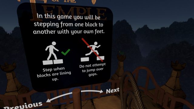
The whole premise of getting around the world via these moving platforms is based on an understanding that the player should step from one platform to another when they’re lined up, and not at other times. The most basic way the game establishes this is by just telling it outright to the player in safety instructions displayed prior to starting the game.
One of the safety instructions shown before the game begins
This instructions is shown for two reasons:
One is safety. You should avoid jumping over gaps, otherwise you would risk jumping right out of your play area and into a wall, for example.
The other is that the game’s system of traversal only works correctly when stepping from one platform to another when they line up. This is not as critical – I’ll get back to later what happens if stepping onto a platform that’s misaligned – but it still provides the best play experience.
Apart from the explicit instructions, the game also employs more subtle tricks to help ensure the player only steps over when blocks are correctly aligned. Consider the following example of a larger 2 x 2 tile static platform the player can step onto. A moving platform arrives from the side in a way that would allow the player to step off well before the platform has stopped moving, but that would break the game’s traversal logic.
In this room, ‘foot fences’ are used to discourage the player from stepping from one platform to another when they are not correctly aligned
To avoid this, “foot fences” were placed to discourage the player from stepping over onto the static platform (or away from it) at incorrect positions. The fences are purely visual and don’t technically prevent anything. The player can still step over them if they try, or right through them for that matter. However, psychologically it feels like less effort to not step over or through a fence and instead step onto the static platform where there’s a gap in the fence. In this way, a purely non-technical solution is used as part of the game’s arsenal of tricks.
Continued on Page 2: Correcting for Unaligned Platforms »
,
Correcting for Unaligned Platforms
At a technical level, the game is always tracking one platform at a time. Generally, when a platform is tracked, that platform is static relative to the physical play area. We can say that the ‘frame of reference’ – the part of the virtual space that the physical play area is currently mapped to – follows the platform. In the illustrations with the 3 by 3 grid overlay, you can think of that grid as the ‘frame of reference’. When stepping onto a new platform, the tracking switches from the old platform to the new, meaning the frame of reference starts following the new platform.
Each platform has a designated spot in the play area, generally corresponding to one of the squares in the 3 by 3 grid (or corresponding to several of the squares if it’s a larger platform). So when the game switches which platform it’s tracking, the old and new platform should be correctly aligned in order for everything to work out right.
However, I mentioned before that it’s not critical if the player steps onto a new platform when it’s not perfectly aligned. Let’s have a quick look at what happens in slow motion.
A platform that is not properly aligned when stepping onto it quickly corrects itself to its proper alignment in the play area
In the clip above, Naysy steps onto a moving platform just as it’s already begun moving away. As a result, once she has stepped onto it, it’s initially about one fifth of a tile out of alignment.
However, as you can see, the platform quickly slides into its correct alignment with respect to the play area. While it happens, the platform kind of slides below your feet, but for small adjustments like here, you often won’t notice it at all. Corrections for larger misalignments are more noticable and may feel a bit weird, but it’s still over in a couple of seconds at maximum, and these tend to happen quite rarely.
In early development, the correction would also kick in if you stepped onto an incoming platform prematurely, before it was properly aligned. However, at one point I realized this is superfluous.
If the frame of reference starts following an incoming platform that’s not correctly aligned yet, it will briefly move a bit in the direction of that platform as part of the correction process. However, once the platform is correctly aligned, the frame of reference will be back where it was a moment ago. Instead of moving the frame of reference a bit in one direction and then the opposite direction, it feels better to just keep it where it is until the platforms are correctly aligned. So I implemented a change where the tracking is simply prevented from switching to an incoming platform until it’s properly aligned. This cut the situations where the correction was needed in half and improved the experience a lot for people who are eager to step onto new platforms.
Constraining Gameplay Inside the Play Area
So far we’ve only talked about stepping between platforms, but of course you do lots of other things in Eye of the Temple too, such as using the whip and collecting gems.
The arm movements you perform when using the whip can be quite quick and drastic, and I quickly found out I couldn’t have the player be close to the edge of their play area when using the whip. It wasn’t viable (or even desirable in my opinion) to vary the gameplay based on the actual size of the player’s play area, so I always assume the minimum size and design around that. In practice this meant that the whip can only be used when standing on a platform that corresponds to the center of the play area.
While using the whip, the player usually needs to be constrained to a single platform corresponding to the center of the play area
This constrained the design possibilities for using the whip a lot. For example, it ruled out a fight with the flying scarabs that would take place while stepping between different platforms. It also meant that puzzles involving the whip needed to always have the whip usage take place when standing on a center platform, and similar for using the whip to hit the breakable pots scattered around the game world.
Of course, it would be tempting and natural for players to use the whip for fun at any time, even when there wasn’t a specific gameplay reason for it. So I had to make the whip roll up into an inactive state whenever the player is not on a platform where using the whip is intended. This can feel like a bummer for some players, but I made the decision that safety simply comes first.
Eventually I found a way to partially work around the single-platform limitation in combat scenarios by using platforms on tracks that all correspond to the center of the play area, and temporarily disabling the whip when using the rollers to go between those tracks. However, as it requires a lot of attention from the player, this approach is only used a few times in the game.
A more complex combat scenario where the player can move between different platforms, but the whip is temporarily disabled while on the connecting roller platforms
The gems in the game are positioned in swirly arcs, with each arc of gems corresponding to a specific platform, so that you can collect them while standing on that platform.
It feels most satisfying to collect gems positioned in arcs to your left or right side, but there are double constraints to take into account. Sometimes there’s a virtual wall to one side, and the gems can’t be placed inside a wall. Other times, you’re standing on a platform that means the edge of your play area is to your left or right. And the gems can’t be placed outside of the play area either, as it might require you to stretch your arm into a space where there’s a physical wall.
The game features gems arranged in swirly arcs, these arcs are constrained by both the virtual geometry and the physical play area
Sometimes there’s a virtual wall to one side, and the edge of the play area to the other side, in which case the gems can only be placed above your head, even if this means they’re less likely to be noticed by you. It would have been tedious to place all the gem arcs manually, taking all constraints into account, so I wrote an algorithm to automate the placement.
Approaches to Room-Scale
Let’s take a step back and consider the moving platforms in comparison to other approaches to designing for room-scale VR.
Below is a comparison of four typical approaches and how they affect immersion and design restrictions. I’ve excluded VR design approaches such as thumbstick virtual movement, movement via vehicle, and running on the spot, since they are not inherently room-scale approaches.
Small Virtual Space – a virtual space as small as the physical space, with one-to-one movement within it. Example: Job Simulator
Immersion:
+ maximum immersionDesign:
− Game must take place in small spaces
Teleportation + Room-scale – user can teleport instantly to nearby positions. Example: The Room VR
Immersion:
− Frequent occurrences of virtual position after teleportation being awkward relative to nearby walls and objects
− Teleportation is an interface people have to learn
− Once learned, it still takes focus away from experience and reduces immersion (Exception: If teleportation is an integrated part of the fiction of the game, like in the game Budget Cuts)Design:
− Moderate restrictions in design to accommodate jumps in position
Non-Euclidean Space – user walks though passages within their play area that form impossible overlapping spaces. Example: Tea for God
Immersion:
+ Stepping with own feet creates great immersion
+ No interface to learn at all
− Limited ability to form a mental map of the world since it’s not spatial in a traditional senseDesign:
− Big design restriction to design a game around non-Eucledian space
− Spaces tend to be dominated by cramped corridors with limited overview of the world
Moving Platforms – user steps between moving platforms. Example: Eye of the Temple
Immersion:
+ Stepping with own feet creates great immersion
+ No interface to learn at allDesign:
− Big design restriction to design a game around moving platforms
− Combining the moving platforms with other game elements pose constant design challenges
Overall my conclusion is that moving platforms can produce one of the strongest experiences of immersion, due to being able to move physically around in large open environments without use of any interface. It’s a great feeling of exploration to see interesting things in the distance, and then make your way there in a way that feels like it’s with your own feet and body.
The downside is that it also places some of the biggest restrictions on the design of the game. Some of those restrictions are apparent to the player – that there’s moving platforms everywhere, which can feel somewhat contrived. Other restrictions on the design take place behind the scenes, as described in the rest of the article above.
Closing Words on Room-Scale
My impression is that most games have stopped experimenting with how to make the most of room-scale VR, but I think there’s still a lot of untapped potential and creative solutions not yet discovered.
I hope you enjoyed this peek behind the scenes, and that just maybe it will inspire more developers to implement novel ways to take full advantage of room-scale VR. And last but not least, if you decide to give Eye of the Temple a try on Steam or Quest 2, I hope you’ll have a great time playing it!
