One of the most interesting things about Vision Pro is the way Apple is positioning its fully immersive capabilities. While many have interpreted the company’s actions as relegating VR to an afterthought, the reality is much more considered.
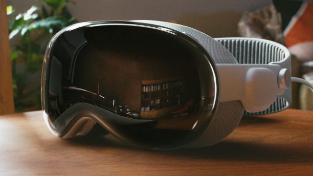
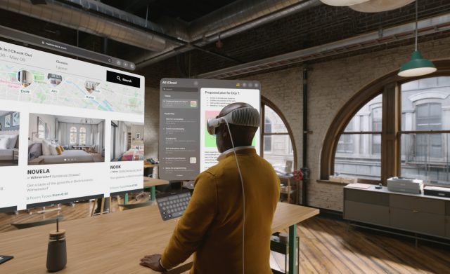
Vision Pro is somewhat ironic. It’s an incredibly powerful and capable VR headset, but Apple has done extensive work to make the default mode feel as little like being in VR as possible. This is of course what’s called ‘passthrough AR’, or sometimes ‘mixed reality’. We’re not quite there yet, but it’s clear that in Apple’s ideal world when you first put on the headset it should feel like nothing around you has even changed.
Apple doesn’t want Vision Pro to take over your reality… at least not all the time. It has gone to extensive lengths to try to seamlessly blend virtual imagery into the room around you. When floating UI panels are created, the are not only subtly transparent (to reveal the real world behind them), but the system even estimates the room’s lighting to cast highlights and shadows on the panels to make them look like they’re really floating there in front of you. It’s impressively convincing.
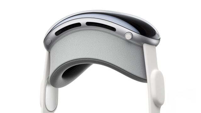
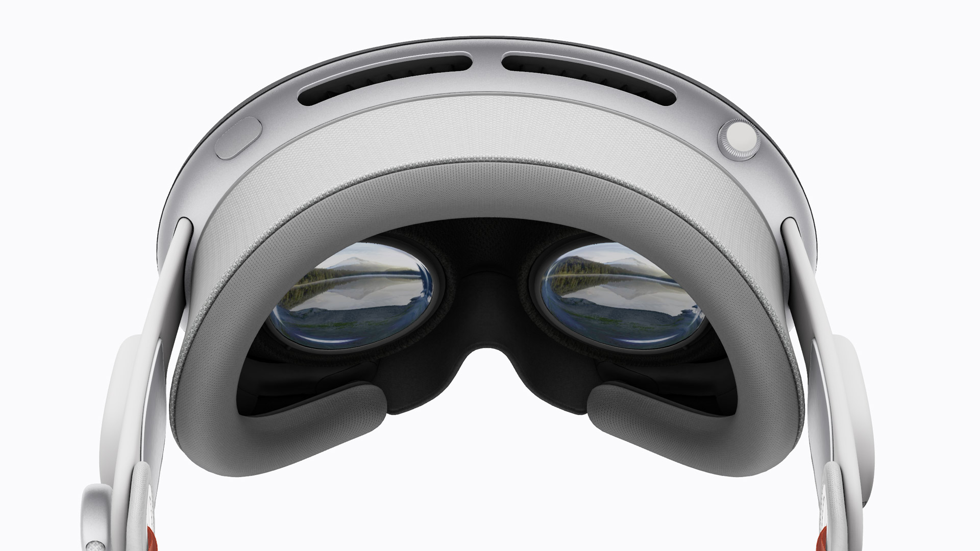
But none of this negates the fact that Vision Pro is a powerful VR headset. In my hands-on demo earlier this year, Apple clearly showed the headset is not only capable of fully immersive VR experiences, but that VR is a core capability of the platform. It even went so far as to add the ‘digital crown’ dial on the top of the headset to make it easy for people to transition between passthrough AR and a fully immersive view.

Much of the commentary surrounding Vision Pro focused on the fact that Apple never actually said the words “virtual reality,” and how the headset lacks the kind of dedicated controllers that are core to most VR headsets today. It was reasoned that this is because the company doesn’t really want Vision Pro to have anything to do with VR.
As I’ve had more time to process my experience of using the headset and my post-demo discussions with some of the people behind the product, it struck me that Apple doesn’t want to avoid fully immersive VR, it’s actually embracing it—but in a way that’s essentially the opposite of what we seen in most other headsets today. And frankly, I think their way is probably the approach the entire industry will adopt.

To understand that, let’s think about Meta’s Quest headsets. Though things might be changing soon with the release of Quest 3, up to this point the company has essentially used VR as the primary mode on its headsets, while passthrough AR was a sort of optional and occasional bonus mode—something apps only sometimes used, or something the user has to consciously toggle on.
On Vision Pro, Apple is doing the reverse. Passthrough AR is the default mode. But fully immersive VR is not being ignored; to the contrary, the company is treating VR as the most focused presentation of content on the headset.
In short, Apple is treating VR like a ‘full-screen’ mode for Vision Pro; the thing you consciously enable when you want to rid yourself of other distractions and get lost in one specific piece of media.
If you think about it, that’s exactly how we use full-screen on our computers and phones today.

Not every application on my computer launches in full-screen and removes my system UI or hides my other windows. In fact, the majority of apps on my computer don’t work this way. Most of the time I want to see my taskbar and my desktop and the various windows and controls that I use to manipulate data on my screen.
But if I’m going to watch a movie or play a game? Full-screen, every time.
That’s because these things are focused experiences where we don’t want to be distracted by anything else. We want to be engrossed by them so we remove the clutter and even let the application hide the mouse and give us a custom interface to better blend it with the media we’re about to engage with.
In the same way that you wouldn’t want every application on your computer to be in full-screen mode—with its own interface and style—Apple doesn’t think every application on your headset should be that way either.
Most should follow familiar patterns and share common interface language. And most do not need to be full-screen (or immersive). In fact, some things not only don’t benefit from being more immersive, in some cases they are made worse. I don’t need a fully immersive environment to view a PDF or spreadsheet. Nor do I need to get rid of all of my other windows and data if I want to play a game of chess. All of those things can still happen, but they don’t need to be my one and only focus.
Most apps can (and should) work seamlessly alongside each other. It’s only when we want that ‘full-screen’ experience that we should give an app permission to take over completely and block out the rest.
And that’s how Apple is treating fully immersive VR on Vision Pro. It isn’t being ignored; the company is simply baking-in the expectation that people don’t want their apps ‘full-screen’ all the time. When someone does want to go full-screen, it’s always a conscious opt-in action, rather than opt-out.
As for the dial on the top of the headset—while some saw this as evidence that Apple wants to make it quick and easy for people to escape fully immersive VR experiences on the headset, I’d argue the company sees the dial as a two way street: it’s both an ‘enter full-screen’ and ‘exit full-screen’ button—the same we expect to see on most media apps.
Ultimately, I think the company’s approach to this will become the norm across the industry. Apple is right: people don’t want their apps full-screen by all the time. Wanting to be fully immersed in one thing is the exception, not the rule.
,
